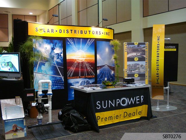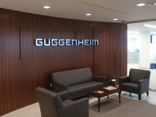
Indoor signs
3/12/2025

If you’re looking for signage design ideas that can blend sophistication with sustainability or can give your audience the impression that you’re on the cutting edge of what’s trending in design, consider earth tones!
But how exactly do you incorporate these shades into your marketing tactics while ensuring they remain effective and true to your own unique brand? Your expert team at Signs By Tomorrow is here to help guide you.
The term “earth tone” refers to colors often found in nature, such as shades of brown, green, beige, orange and blue. Think about the colors of clay-rich soil, lush forests and tranquil rivers. They’re often soft and understated but have a universal appeal incorporated into your graphic design.
The Pantone Color of the Year 2025 was revealed to be “Mocha Mousse,” a warm, medium shade of brown. Other popular choices from the larger Pantone Color Chart that fall into the realm of earth tones are “Desert Sage” or “Forest Biome,” but there are even more to be found that may work for you and your business.
Especially indoors, they can set a calming, yet professional tone – while signaling a connection to nature, too. These are characteristics that are increasingly popular with today’s eco-conscious consumer base, so they’re absolutely worth considering including in your design!
There are several paths to incorporating earth tones in your graphic design and signage, both indoors and outside. Here’s a few you may want to consider:
Using earth tones in your marketing and signage design can help your business make a statement. By making use of these natural color choices, you can help evoke a sense of warmth and eco-consciousness while still creating a modern, professional atmosphere at your workplace.
Interested in creating a statement at your company with earth tones? Signs By Tomorrow can help you with extensive sign design services that will meet your needs – no matter what they may be. Contact us today for a consultation!
2835 Antoine Drive, Suite D
Houston, TX 77092
Tel: 713-622-4888
Monday - Friday
9:00am - 5:30pm